There's a lot of text in that video, Erik!...

Please don't underestimate how powerful and enabling a "straighforward" graphical interface can be. This is not about reinventing the wheel necessarily. The "spaghetti" of the Max/MSP screenshot is just an example of sloppy work. But some people like this. In Quest3D, you can collapse branches of the flowchart in folders. Or you can simply make hundreds and hundreds of different flowcharts that all call each other with parameters, etc.
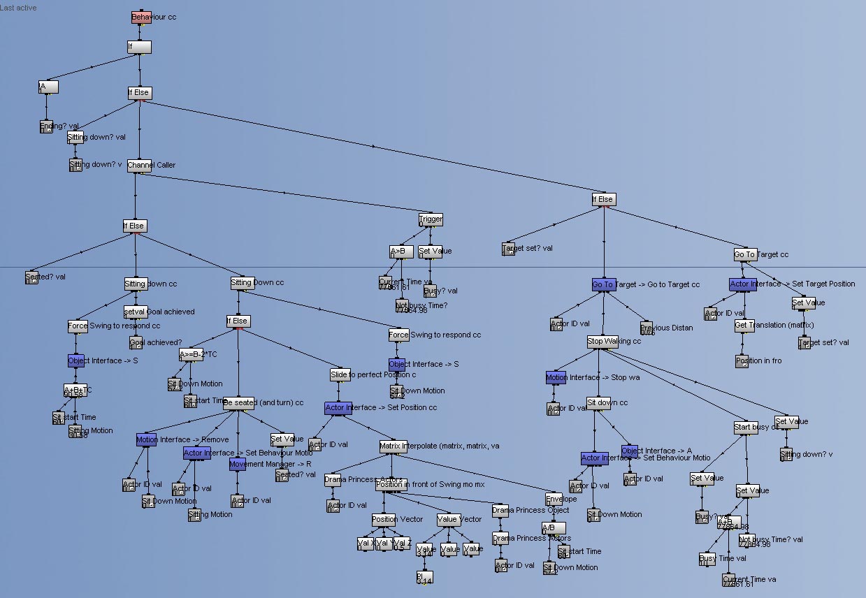
This is what part of The Path looks like in Quest3D (this makes a character walk to a swing and sit down):

This works from top to bottom, from left to right. The entire flowchart is called every frame when running, starting with the orange box at the top.
The dark blue boxes are callers to other flow charts, called "channel groups" in Quest3D. The orange box at the top allows for other groups to call this one.
It doesn't matter that it is more cumbersome to connect two "value" boxes to an "operator" box instead of simply typing "5+4". The point, for me, of graphical programming, is not to make the work
faster, it's to allow me to be more
creative, to experiment more, to "paint with algorithms". Even if it takes
more time to set up, and is not as elegant, the fact that I can
see the logic makes all the difference to my brain.
When I look at the flowchart above, I see how the logic works. Without having to decipher any code. Maybe this is different for engineers. But my brain is happy when it can look at flowcharts instead of text.

