Notgames Forum
November 25, 2024, 07:07:33 AM *
Welcome, Guest. Please login or register.

Login with username, password and session length
 
   Home   Help Search Calendar Login Register  
Pages: [1]
  Print  
Author Topic: Visually/esthetically interesting stuff  (Read 33175 times)
Utforska

Posts: 65


View Profile
« on: June 21, 2010, 12:52:23 PM »

I think Limbo has something very interesting going on. Conceptually the visuals are kind of simple, but it seems like they're being extremely consistent with the style. It's the kind of style that, if you see a screenshot, you'd think "oh, nice concept art, but of course the actual gameplay isn't going to look anything like that". But then it actually looks exactly like that.

Since it's such a visual medium, I thought it could be interesting to collect examples of games (or notgames) with interesting visuals. There are tons of games going for realism, but often something more stylized can be so much more striking.

Have any examples?
Logged
Kjell

Posts: 129


View Profile
« Reply #1 on: June 21, 2010, 10:15:36 PM »

Quote
There are tons of games going for realism, but often something more stylized can be so much more striking.

Agreed Smiley First batch off the top of my head ..

El Shaddai ( 360 )


Machinarium ( PC )


Rez ( Dreamcast )


Mojib Ribbon ( PS2 )


Noby Noby Boy ( PS3 )


The Neverhood ( PC )


Okami ( PS2 )


Shadow of the Colossus ( PS2 )


Journey ( PS3 )


Killer7 ( Gamecube )


MadWorld ( Wii )


Patapon ( PSP )


Jet Set Radio ( Dreamcast )


Nanatsu Kaze No Shima Monogatari ( Saturn )


Golf? ( PC )


X-Scape ( DSi )
« Last Edit: June 22, 2010, 12:58:17 AM by Kjell » Logged
ghostwheel

Posts: 584


View Profile WWW
« Reply #2 on: June 22, 2010, 12:30:17 AM »

Not a single PC game in there. :/
Logged

Irony is for cowards.
Kjell

Posts: 129


View Profile
« Reply #3 on: June 22, 2010, 01:00:47 AM »

@ghostwheel - Added a couple more .. including 2 PC games on top of the one ( Golf? ) you missed Wink
Logged
Michaël Samyn

Posts: 2042


View Profile WWW
« Reply #4 on: June 22, 2010, 09:44:57 AM »

We had a little thread for this back in the day. This one may be appropriate too. All a bit outdated now.  Embarrassed
Logged
Kjell

Posts: 129


View Profile
« Reply #5 on: June 22, 2010, 07:19:27 PM »

It never hurts to have another "mirror" Wink A bunch more ..

Darwinia ( PC )


Love ( PC )


Viewtiful Joe ( Gamecube )


Rakugaki Showtime ( PSOne )


Katamari Damacy ( PS2 )


Another World ( PC )


3D Dot Heroes ( PS3 )


The Wind Waker ( Gamecube )


Virtua Racing ( Arcade )


Loco Roco ( PSP )
Logged
Utforska

Posts: 65


View Profile
« Reply #6 on: June 23, 2010, 09:50:34 AM »

Wow, a pretty massive collection there Kjell! Many of which I hadn't seen. Interesting. Madworld looks cool, though the gameplay probably isn't my cup of tea...

I'd like to add Kometen and pretty much everything by Tale of tales - both of course involving people active at this forum.

Except for Kometen and Vanitas, here are a few other interesting iPhone games.
Enviro Bear:

Edge:

Zen Bound:

Memovator:


I also enjoyed the flash game Little Wheel:


Paper Moon is also very pretty:


Then everything by Vectorpark, such as Windosill:


Logged
Michaël Samyn

Posts: 2042


View Profile WWW
« Reply #7 on: June 23, 2010, 02:54:06 PM »

It's interesting that we all seem to go for stylized aesthetics when asked for preferences. Though I think some of the more realistic-looking games are very impressive aesthetically as well.
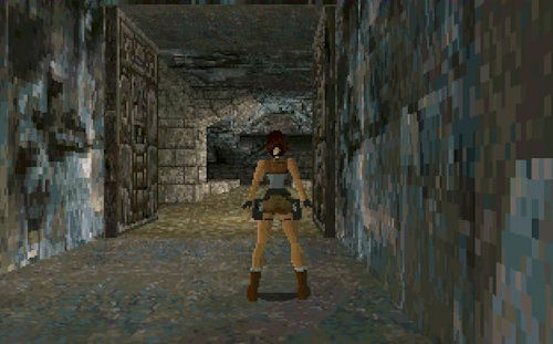

I've always admired Tomb Raider 1's atmosphere and colour palette. And I feel the developers were never able to match the first game, aesthetically, no matter how much technology they threw at it.


Few people think of Grand Theft Auto 3 when talking about game aesthetics. Yet I think it's a very beautiful game, again mostly because of its subtle colour palette.
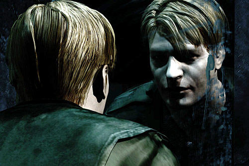

Takayoshi Sato's character design in Silent Hill 2 is unparalleled!


And then there's of course Ico, the aesthetic masterpiece of the Playstation 2.


Guild Wars' vistas can be quite stunning. And its characters are the most elegant I've seen in a multiplayer game.
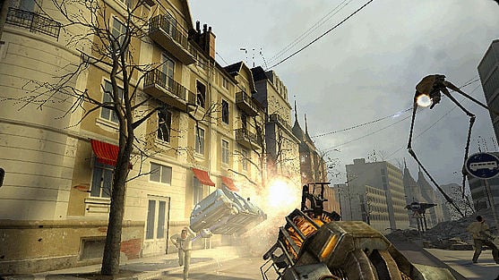

When Half Life 2 came out, people seemed to be attributing its beauty to the Source engine. But it as really the work of the art directors that made the difference!


I think Kane & Lynch 2 is also looks very interesting, with all its simulated video artefacts.


And I found the cities in Assassin's Creed (both 1 & 2) very impressive, aesthetically.
(though I wish we could redo their ambient sound design... Wink ).
Logged
ghostwheel

Posts: 584


View Profile WWW
« Reply #8 on: June 23, 2010, 11:48:25 PM »

It does sort of have the dubious honor of starting the trend of brown and grey color palettes that dominate the FPS genre even to this day but I always loved the grim, dark look of the original Quake. Coupled with Trent Reznor's soundtrack, it was an amazing experience.


Video: http://www.youtube.com/watch?v=lpas-Yb5HOo


Wipeout series is another beautifully slick package of visuals and sound though nearly 180 turn from the look of Quake. The image below is from the latest in the series, Wipeout HD:


Video: http://www.youtube.com/watch?v=BjNvlmObjeY&hd=1


And for sheer beauty, it's hard to pass up mentioning the Myst series. This is from Myst V:


Video: http://www.youtube.com/watch?v=og2JlxgdolA&hd=1#t=04m12s


I don't like RTS games but the minimalist graphics, pastel colors and soothing music make for a thoughtful yet laid-back experience in Eufloria:


Video: http://www.youtube.com/watch?v=4y0sruVQU8c&hd=1


Castle of Illusion Starring Mick Mouse. A beautiful 16 bit game and fine example of gorgeous pixel art:


http://www.youtube.com/watch?v=4Ix1gWkjd1w#t=01m51s
Logged

Irony is for cowards.
Pages: [1]
  Print  
 
Jump to:  

Powered by MySQL Powered by PHP Powered by SMF 1.1.20 | SMF © 2006-2008, Simple Machines Valid XHTML 1.0! Valid CSS!